More Information
More Like This
Tiny City Garden in Ballsbridge, Dublin 4
Ballsbridge, Dublin 4
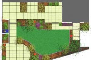
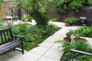
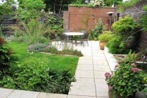
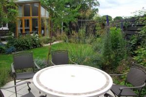
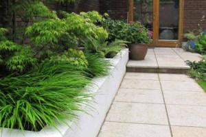
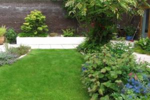
This triangular garden in Ballsbridge was covered in concrete and slabs and the clients didn’t think a lovely garden would be possible to achieve with the shape and lack of soil. The walls were also quite unappealing. The clients didn’t want to over spend as they assumed they would be upscaling in a few years. Seven years later they didn’t want to move as they loved their garden so much.
Due to the awkward shape I chose a 45 degree angle for the paving which would shift the orientation of the patio and beds towards the longest wall thereby creating the ‘illusion’ of a wider garden.
There was plenty of space for a generous main patio, the big man-hole was integrated into a large bed with planting surrounding it but still easily accessible if necessary. I planned in a small destination at the rear with a raised bed to sit on.
I love the way the garden looks and feels bigger than its humble dimensions and how lush the planting looks with the black backdrop of the walls.
Small Garden in Dun Laoghaire
Dun Laoghaire, Co. Dublin
This small garden in Dun Laoghaire is one of my favourites. The client was retired and down sized when they bought this new build with a blank canvas rear garden. The brief was to create a relatively low maintenance garden with an abundance of colour and structure. They also wanted a small shed, a sitting area at the rear to avail of shade on very warm days and no lawn.
The change to the atmosphere of the garden was radical. The photos with the plants were taken less than two years after planting and were chosen and placed by Oliver Schurmann ( Mount Venus Nursery) specifically for this garden after a meeting with the client when the hard and soft landscaping was complete.
The client was surprised at how little maintenance was involved in the first two years and this was due to the chosen plants covering the bare soil within this time period and becoming a shield against weeds establishing themselves in the beds. A further two years on the garden is still as vibrant as ever and most of the plants have reached their maximum size. The trees will continue to grow for another few years but have been specifically chosen to not over-shadow the garden when they reach their maximum size.
Large Garden in Dalkey, Co. Dublin
Dalkey, Co. Dublin
This project was challenging but very rewarding. The clients had what was essentially a muddy field at the rear. Along the side of the house they had already installed a deck with raised beds when they had renovated the house prior to moving in. They waited for a while before tackling the main area at the rear. The brief was to create a lush, meandering garden with tree ferns and no lawn.
We developed a plan with a path circumnavigating the garden going from decking onto a pebble path to a small informal sitting area and then along a board walk past a pond to return to the house. The clients didn’t want to be able to see the entire garden from the house but wanted a layout that would entice them and visitors to walk around the garden to experience the full beauty of the planting and the old granite walls. The rendered walls and the shed were painted black which reduced their visual impact and highlighted the plants in the foreground.
City Garden with Outdoor Kitchen
City Centre, Dublin
Nestled in the heart of Dublin city this garden was relatively large considering its location. The main upper area was a blank canvas with beautiful aged brick walls on either side of the space and with a mews to the rear. The lower cellar level already had charm but the clients were keen to bring in a lot of planting in high raised beds. They were also keen to include lush planting on the upper level.
Burnt and then oiled wooden sleepers were used (clients’ idea) on the lower level which allowed water to seep through the troughs onto the existing stone slabs and into the drains.
On the upper level the raised beds were constructed using granite curbs. The clients also wanted lighting to be supplied by hanging lanterns which they had already purchased and these were to be hung from a wooden construction they had seen used in Japanese garden. We built these and also burnt and oiled them. An outdoor kitchen with a wooden roof and robust counters was constructed over a cobbled area against the wall of the house. Again the wood was burnt and oiled pre construction.
The plants were chosen by the clients with the help of Oliver Schurmann. The clients were keen to give a Japanese touch to the plant schemes, hence the inclusion of some very interesting and rare specimen trees and plants.
It was a truly wonderful experience working with these clients. I felt we had developed the concept together and I know they will cherish this garden for year to come. I hope to visit every few years to see it mature and age gracefully
Leafy Garden With Water Feature in Rush
Rush, Co. Dublin
The original concept for this garden came from Oliver Schurmann of Mount Venus Nursery in Rathfarnham. The clients knew of his reputation for very natural and sustainable planting concepts. My clients also wished to extend their rear garden into an adjacent plot which they had recently acquired and to integrate a painting studio into the concept. The new studio is surrounded by lush woodland planting with a water feature starting at the house, flowing with numerous cascades down to a main pond at the rear of the garden. The new section of garden was significantly lower than the existing garden but by importing a large amount of soil and introducing a drainage system the split levels were softened and the height difference became an important aspect of the new design. The photos show the garden only two years later both in spring and autumn. The growth-rate of the plants after such a short period of time indicates how the garden will mature in years to come. Eventually the garden will look and feel as if it had developed naturally over a much longer period of time.
The original concept for this garden came from Oliver Schurmann of Mount Venus Nursery in Rathfarnham. The clients knew of his reputation for very natural and sustainable planting ...Kitchen Garden In Dublin City
Our customer wanted a garden that for relaxing, but they also wanted to be able to grow plants, flowers and vegetables. We created a garden that has a modern feel, but uses very natural materials and works well as a traditional kitchen garden. The design process inspired several features that worked really well. We extended the roofs of the two small sheds at the rear of the garden so that they met in the middle. This created a sheltered area, perfect for rainy days. A water feature adds impact and brightens up a dark area of the garden which is bordered by walls, an idea that was proposed by Oliver Shurman of Venus Nurseries. And for the gardeners, there are two large planting bed which provide plenty of fresh vegetable and salads.
Our customer wanted a garden that for relaxing, but they also wanted to be able to grow plants, flowers and vegetables. We created a garden that has a modern feel, but uses very ...Small Garden In Cabinteely
The first time I saw this garden it was dominated by a decked area, shed and a climbing frame. The deck was only slightly higher than the rest of the garden. However, it was surrounded by a balustrade which added to the overcrowded feeling. My two clients had different ideas for the garden. One wanted to pave the whole area and the other client wanted a lawn. The plan I came up with satisfied them both and they were very happy with the finished garden. The trick to giving the feeling of space in quite a small garden is to keep forms and materials simple. The shape of the lawn makes it look bigger despite being very a little area. We used as much of the existing plants in the garden and supplemented with some ground covering plants and colourful perennials.
The first time I saw this garden it was dominated by a decked area, shed and a climbing frame. The deck was only slightly higher than the rest of the garden. However, it was surrounded ...Bloom 2008 Medium Garden Medal Winner
The design concept in this garden was about almost hiding the structure within the planting. It feels as if a garden has been carved from a natural nook with a stream gently flowing through it. Two curved patios emerge from the planting as if dropped from above, linked by a bridge over water. A curved lava block wall adds tones of an ancient Japanese ruins.
The design concept in this garden was about almost hiding the structure within the planting. It feels as if a garden has been carved from a natural nook with a stream gently flowing ...Templeogue Garden With Natural Planting
Templeogue, Co. Dublin
This garden was a wide, long site, completely blank other than an existing patio. My design concept was to break this space up and create a very natural garden. In this way, the harsh boundaries lines would be softened and the garden would look larger as an added benefit. We created a raised area in the middle of the garden using large boulders and flat stepping stones. This created a secluded area at the rear of the garden with a peaceful space for relaxing.
This garden was a wide, long site, completely blank other than an existing patio. My design concept was to break this space up and create a very natural garden. In this way, the ...